What we were asked to do
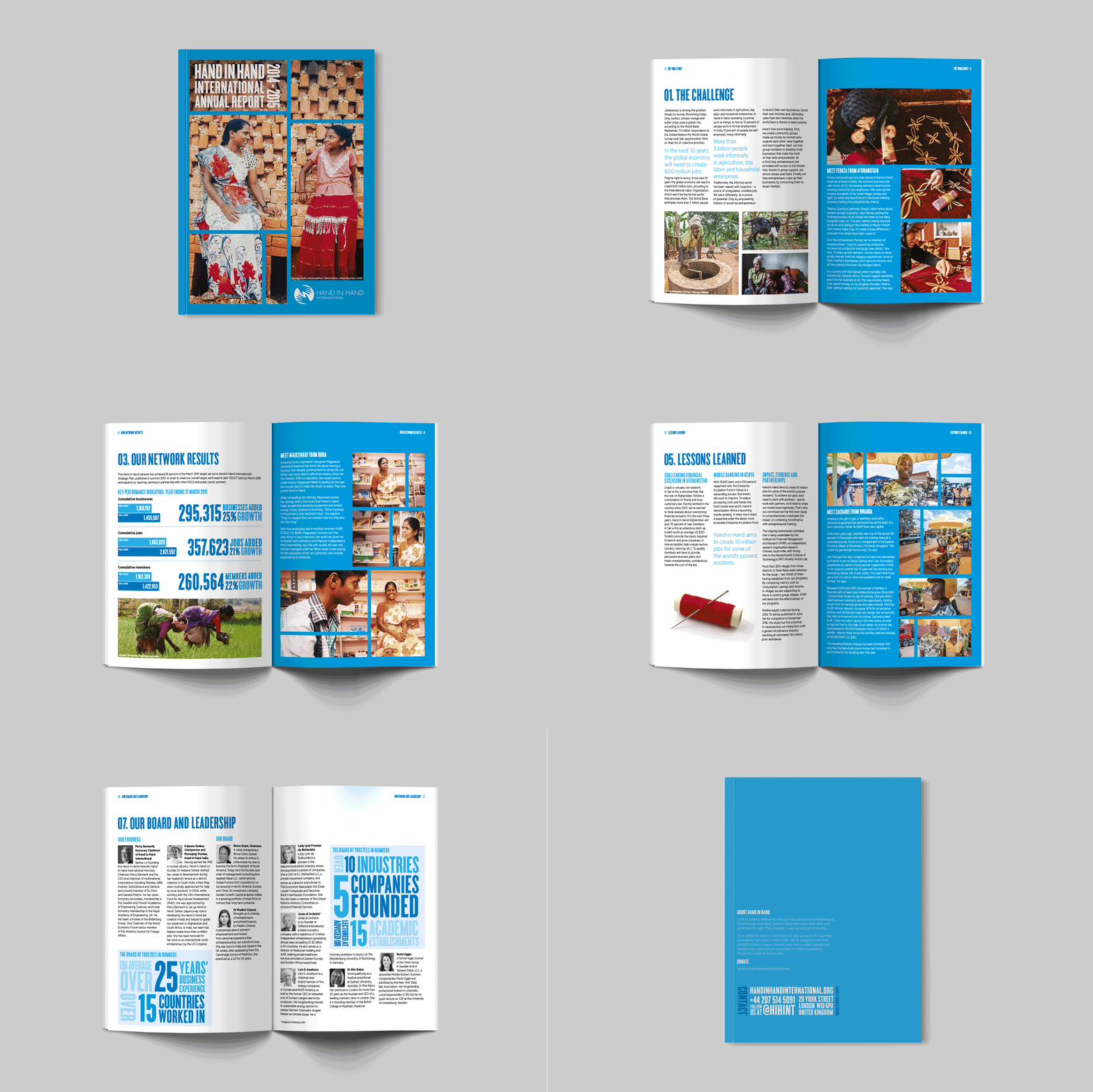
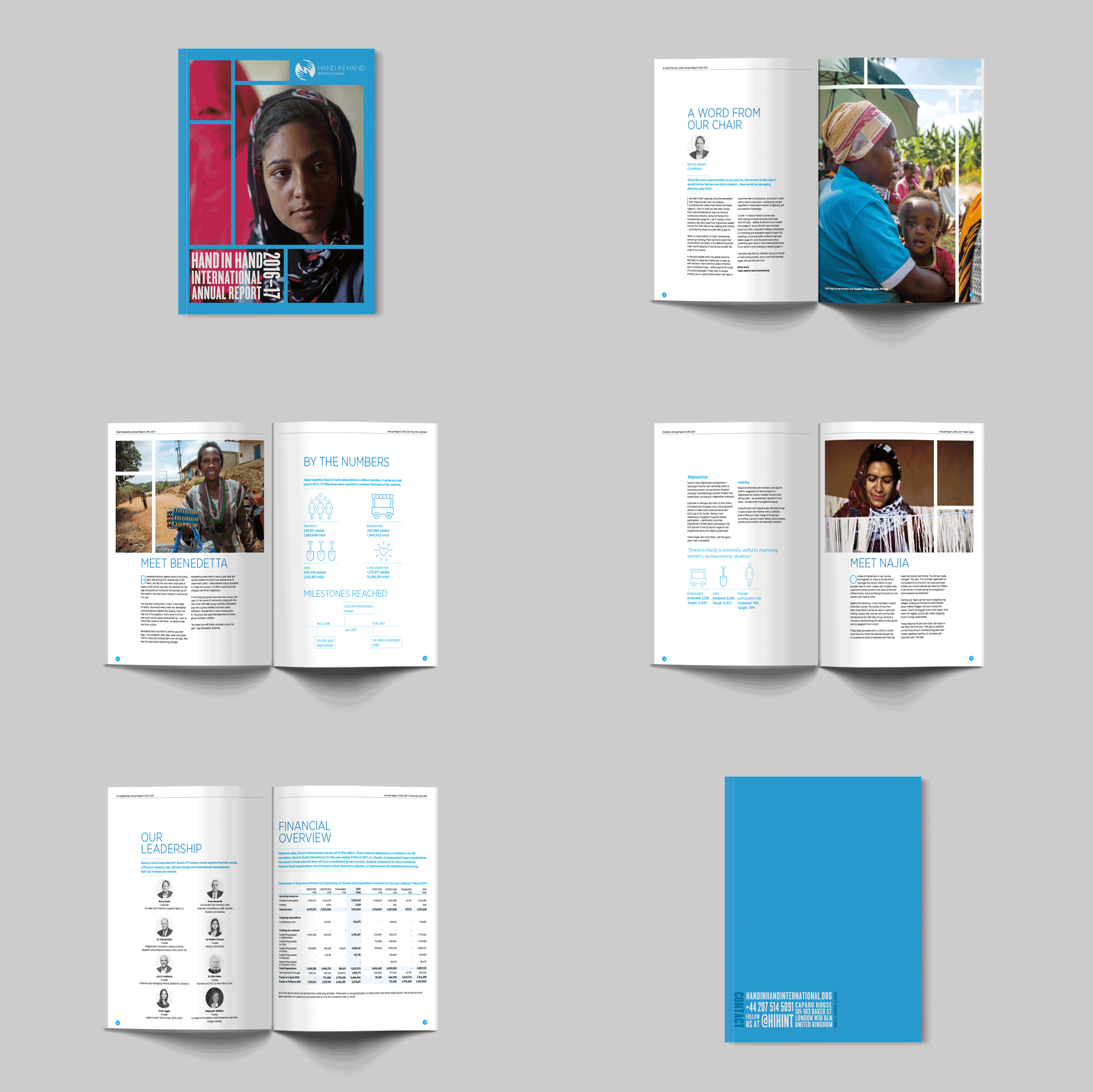
In response to the Hand in Hand rebrand in 2014, our team undertook the task of revamping their annual reports and crafting a timeless visual identity. This involved strategic deliberation on integrating the new colour scheme, image selection, and defining a cohesive style for icons and infographics, ensuring enduring relevance.
What we did
Before revamping the annual reports post the 2014 Hand in Hand rebrand, we delved into the organisation's history to ensure a fitting transition. Opting for a bold, image-centric style reflecting their brand colours, we kept internal pages clean and concise. Branded icons and simple infographics were incorporated for easy comprehension.


What they thought about it
The client was thrilled with the finished report and stuck with this style from 2014 all the way through to 2017. This ongoing adoption speaks volumes about their satisfaction and confirms the effectiveness of our design in capturing their essence and maintaining a consistent visual identity.


