What they asked us to do
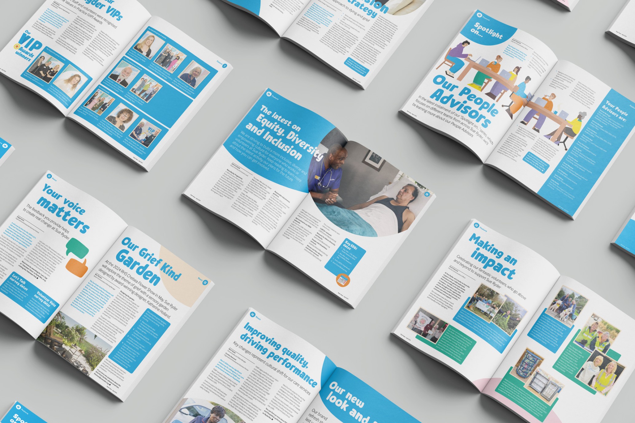
We were assigned the task of designing the Sue Ryder staff newsletter following the organisation's rebranding. The pagination, content type, and timelines mirrored those of previous editions. Our objective was to promptly and efficiently integrate the new brand into Edition 38 to meet the deadline.
What we did
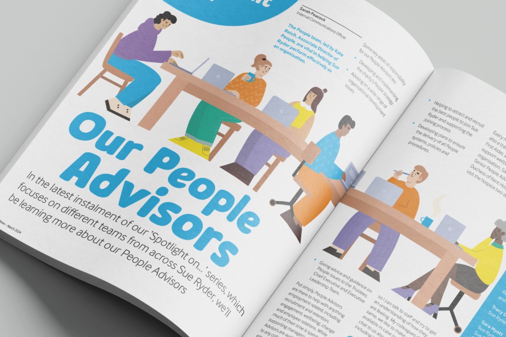
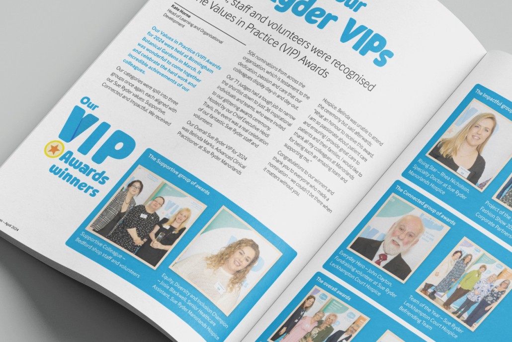
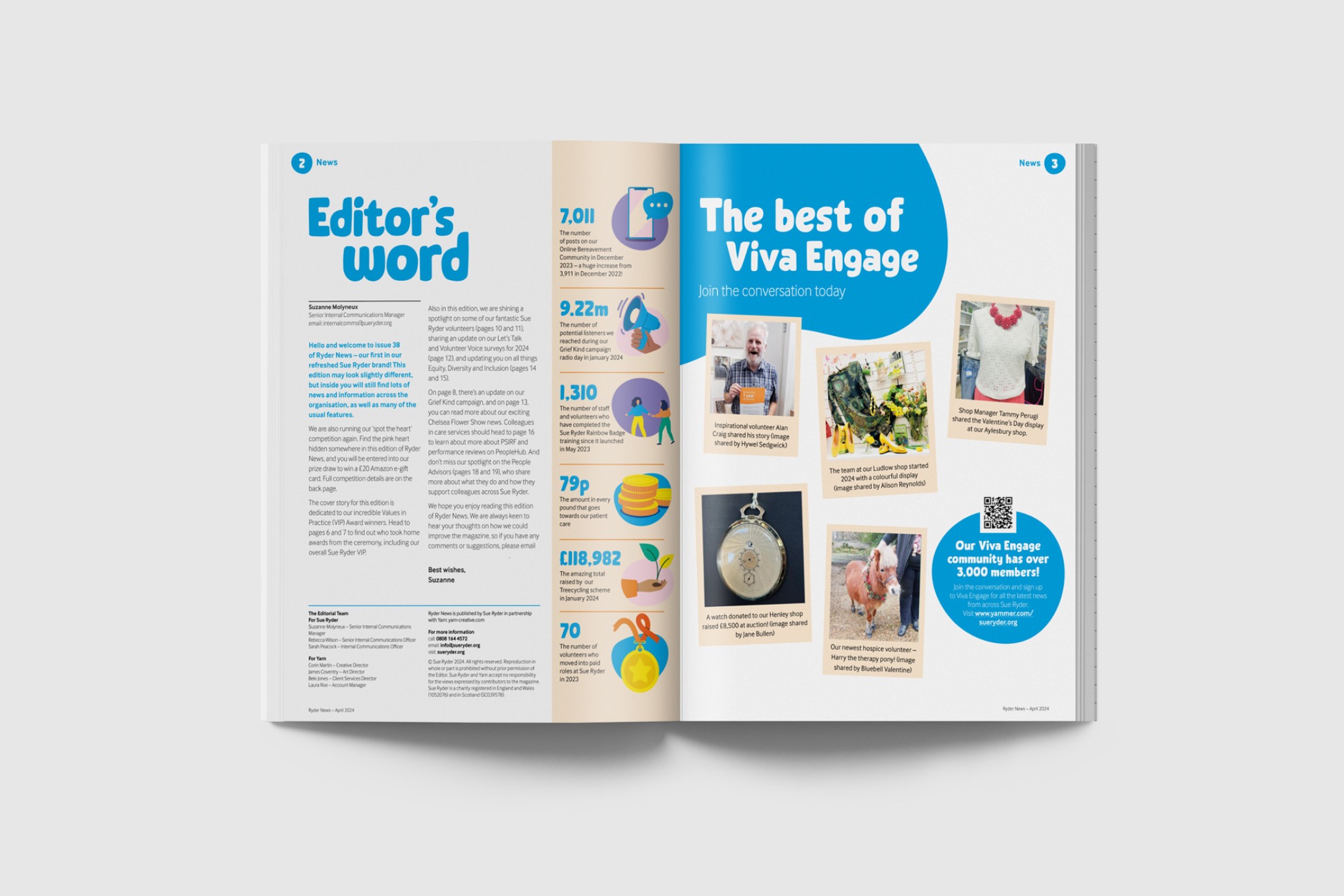
While we've been crafting Sue Ryder newsletters for 10 years now, this edition truly stood out. Initially, we formulated three distinct concepts in line with the brand guidelines, envisioning the newsletter's unique style. Upon refining these concepts, we proceeded with the initial layout, using the client's copy and images. Carefully maintaining consistency in shapes, colours, and fonts, we ensured that the final product aligned perfectly with the brand's identity.
What they thought
"We are really pleased with our new edition of Ryder News - the first in our new brand. The team at Yarn were very receptive to our feedback and came up with some great ideas on how to make the magazine visually engaging.
Feedback so far includes:
"Thank you for another great edition of Ryder News"
"I enjoyed reading about the brand refresh as well as all the other articles within the issue"
Our 'Find the heart' competition has also generated a high number of entries, showing that our staff and volunteers are embracing the new look - Yarn hid the heart in a really clever place, which is encouraging people to read the magazine more thoroughly. Thank you!"
Suzanne Molyneux
Senior Internal Communications Manager